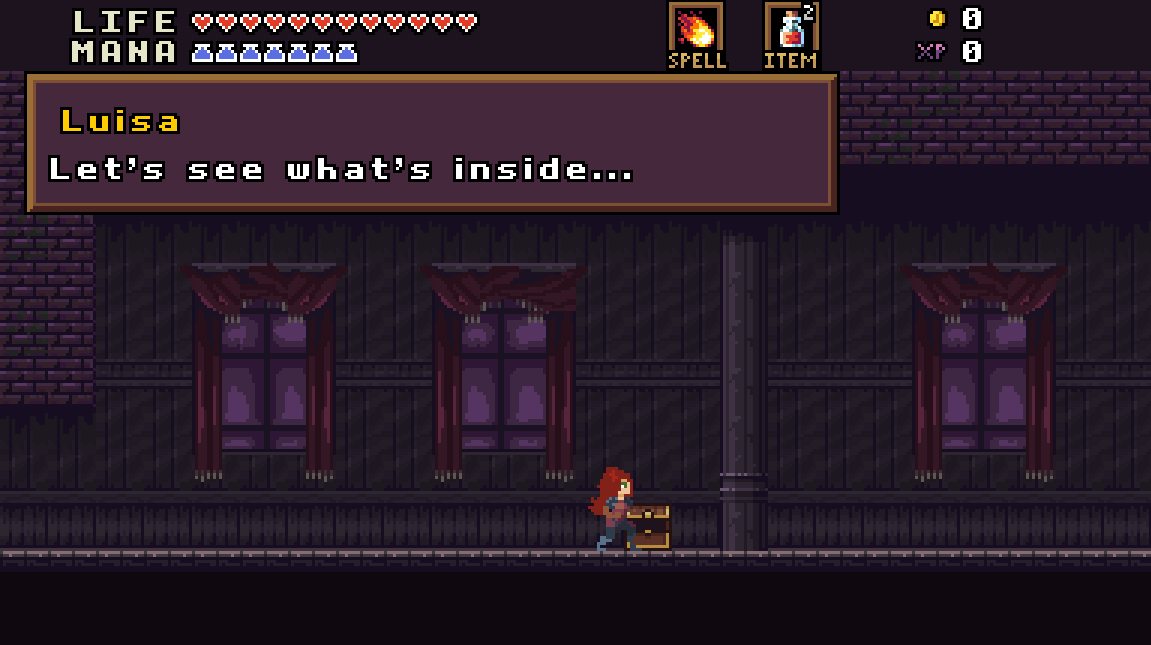
The HUD is very small (only 24 pixels tall), so there isn't much room to work. I had originally wanted to put a mini map in one of the corners, but it had to be cut. It's very easy to overcrowd the UI elements with data. I think what I have now is a good balance. Some of the art may change, but the positioning is very close to final.
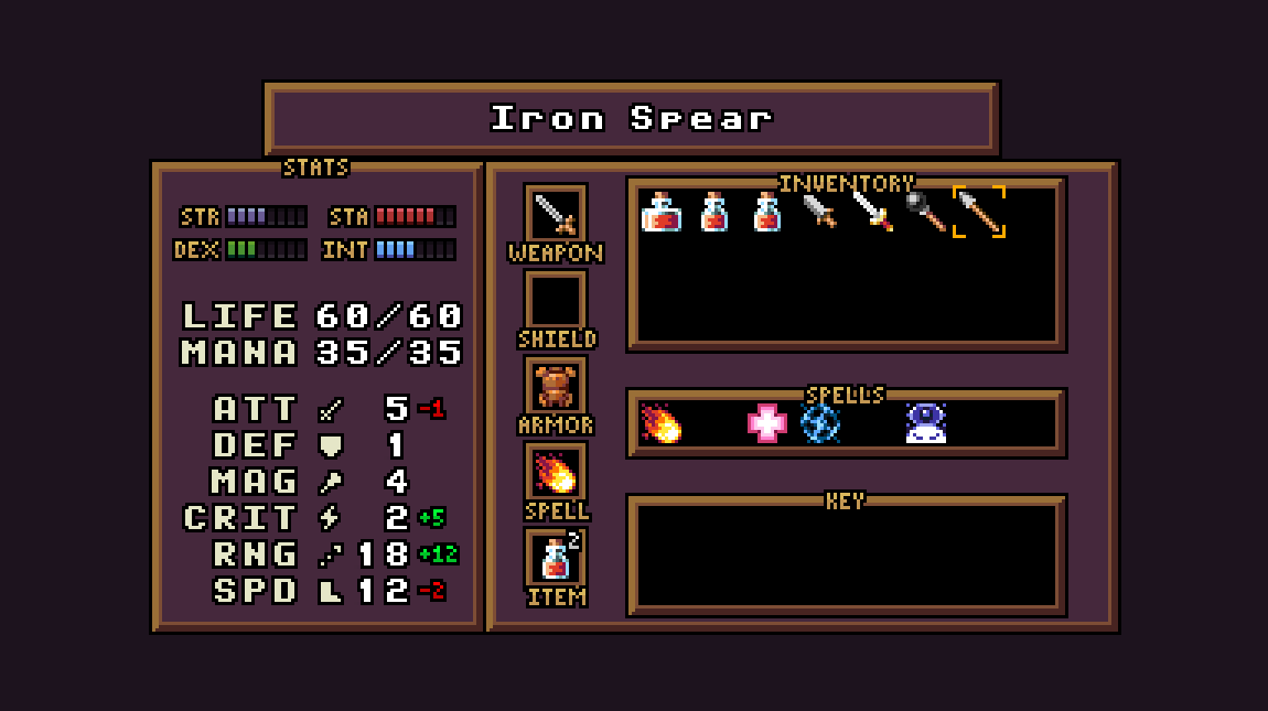
The inventory was definitely the biggest job of the past couple of weeks. Not only did I completely re-skin and reorganize the stat and equipment panels, but I also made some major changes to the data structures that interact with the inventory. I'm quite happy with it at this point. It's very easy to compare items, and your bag is automatically sorted whenever you pick something up. The Shield slot may be replaced by a Ring slot.
The map still needs some work. It's pretty plain. It uses a pretty standard format found in 'Metroidvania' style games. I gave the perimeter of the map a hard black border to make it stand out more. The game is actually comprised of two large maps: the 'front' map and the 'back' map (an idea I'm borrowing from The Goonies 2). When opening the map UI, it'll default to the map you're currently on, but you'll easily be able to toggle between the two.
I've been focusing on stats, combat mechanics, and loot this week. I'm hoping to start implementing the first boss very soon. I also need to work on a better system for dialog and cut scene control.
That's all for now. I'm hungry!